Sass select components
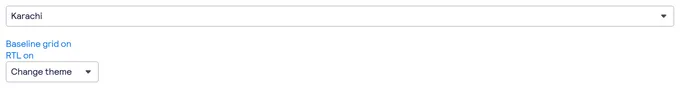
27 selects are styled using Sass. A select is a type of input that allows users to choose one or more options from a list of choices. The options are hidden by default and revealed when a user interacts with an element. It shows the currently selected option in its default collapsed state. Sass is a styling format that is compiled into CSS. It extends CSS with advanced features like scripting, mixins, and nesting. Sass is used to style 16 projects.
27components134storiesLast updated yesterday

SbSelect

bpk-component-select


Select


Select

Select Dropdown

Select Card

Select

SelectionGroup

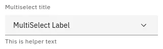
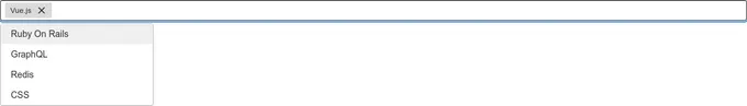
MultiSelect


form-select

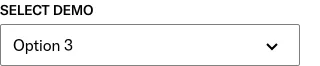
Select


Select Status

SelectAllActions
Select Button
Selection
Select
token_selector
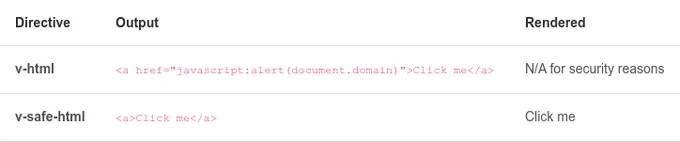
safe-html-directive

safe-link-directive

Select Button Group