Popover components
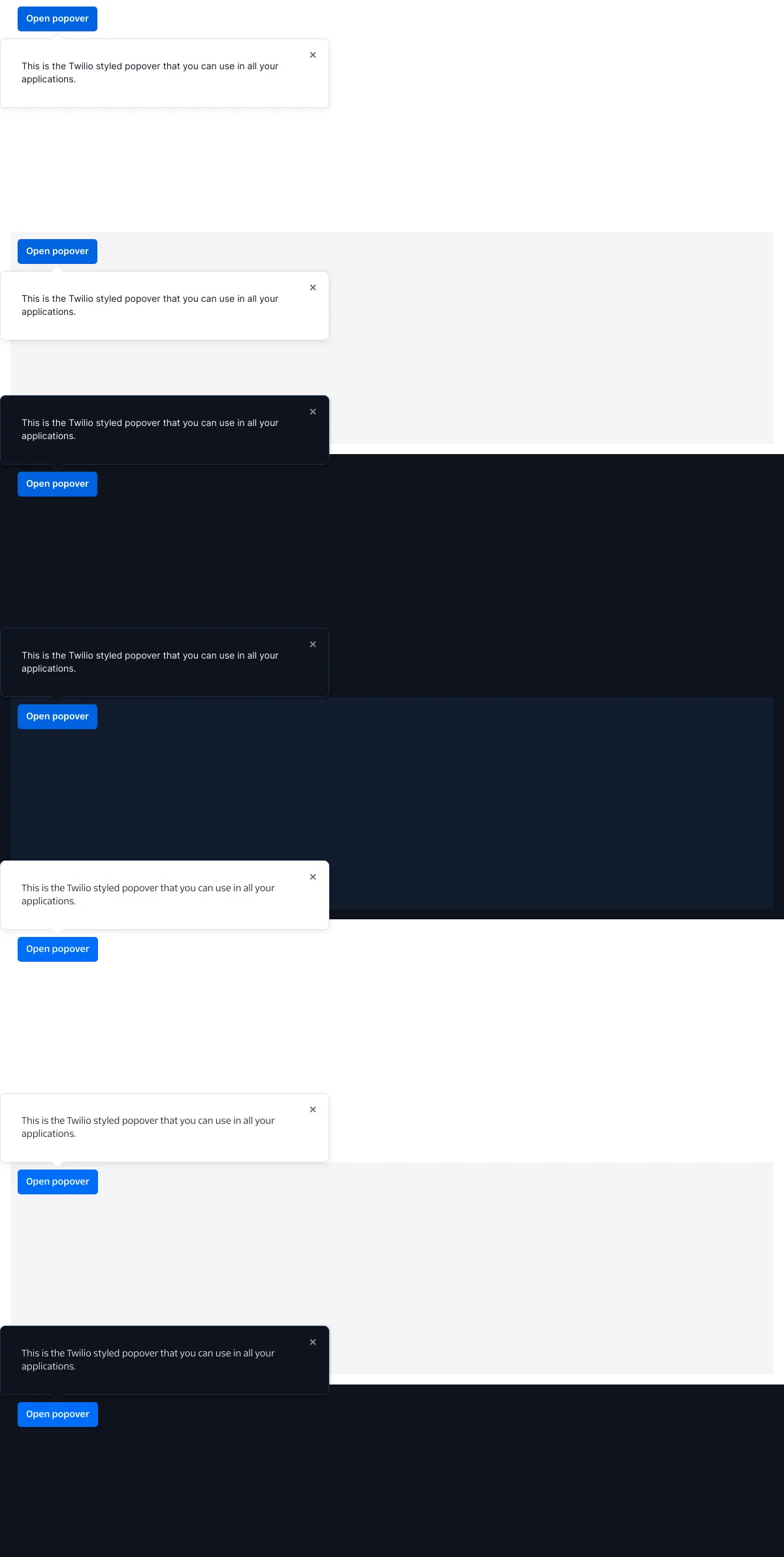
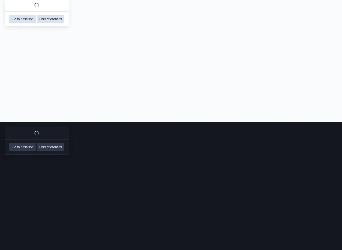
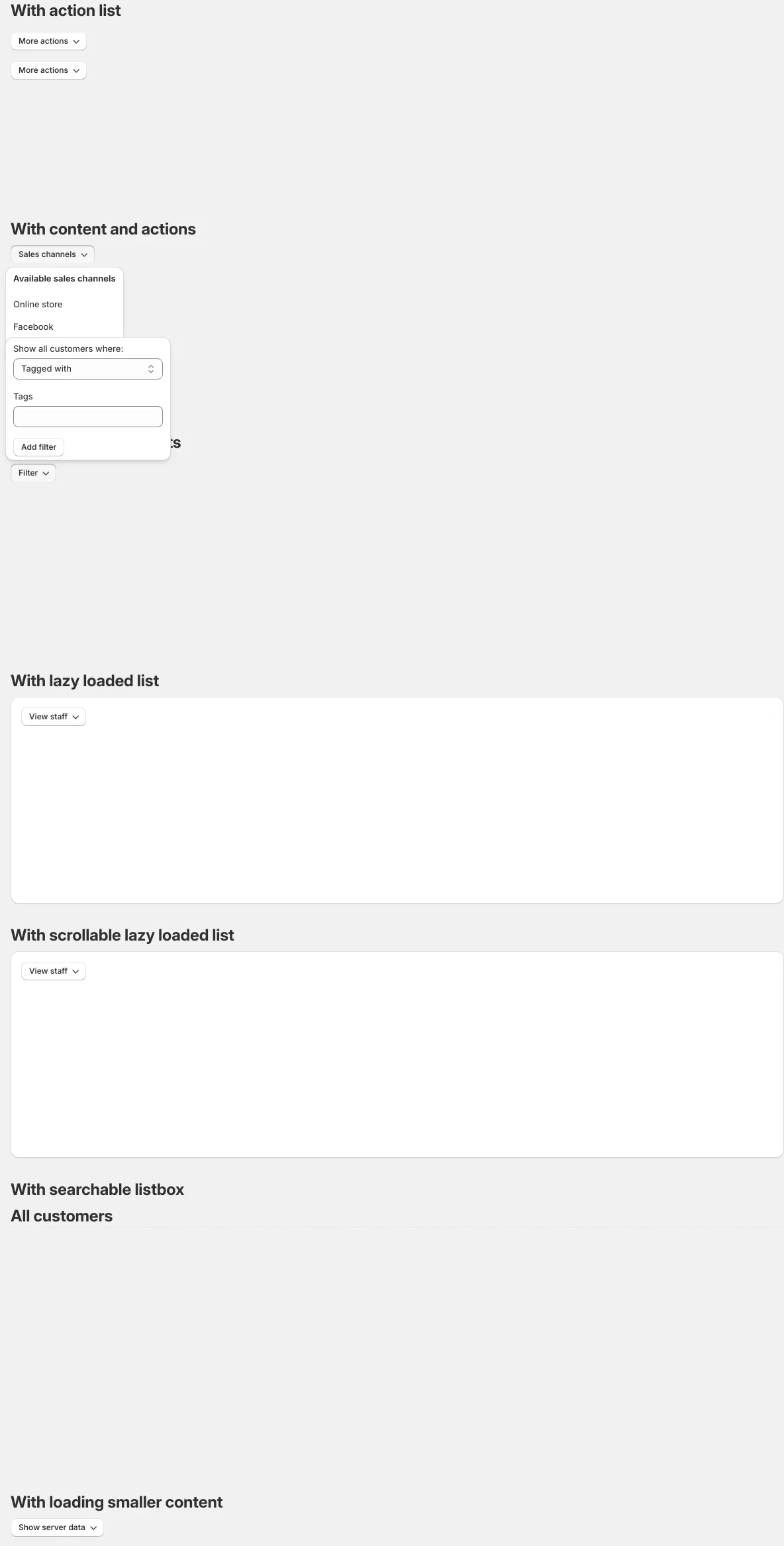
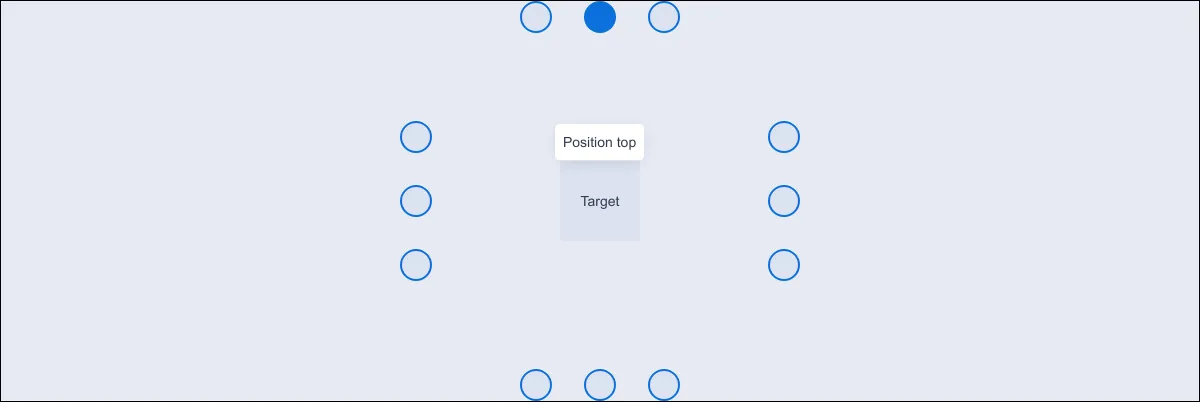
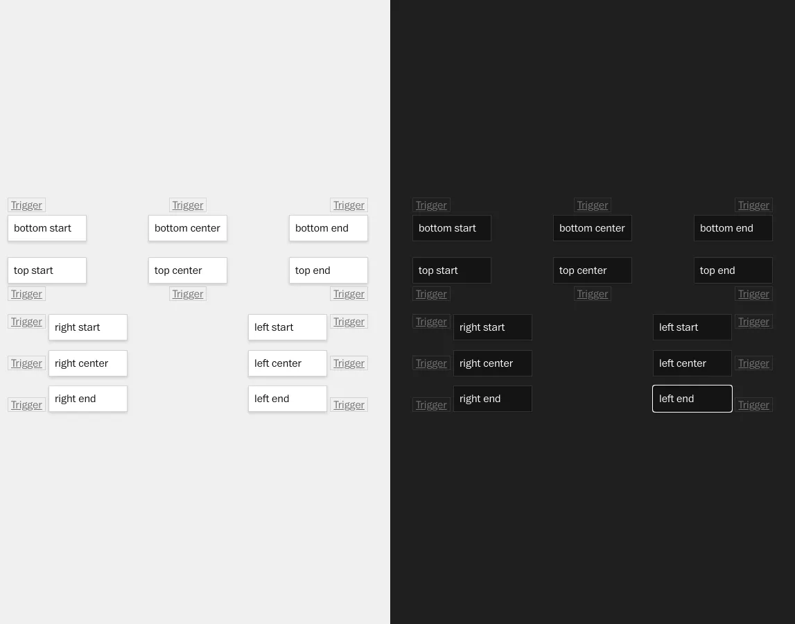
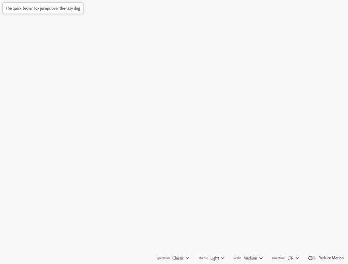
Popover is a message box that displays extra information about an element. It can appear on hover, click, or tap.
53components284storiesLast updated yesterday
Popover is a message box that displays extra information about an element. It can appear on hover, click, or tap.