Back to glossary
Add your project

Sass modal components

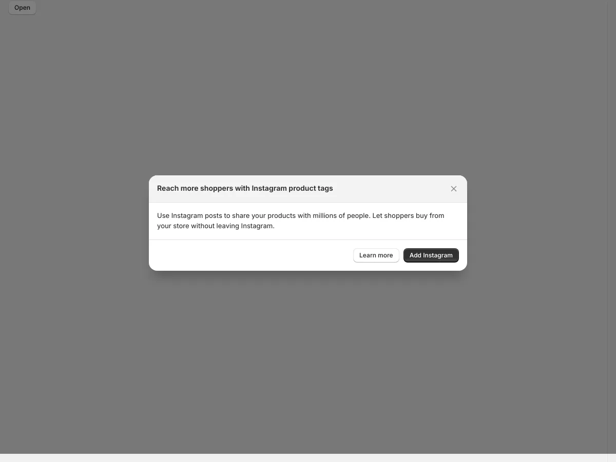
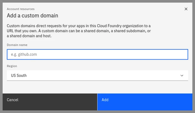
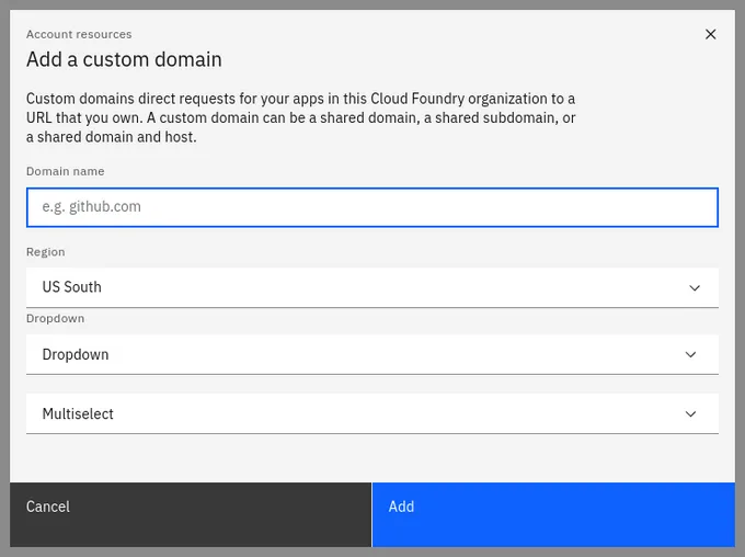
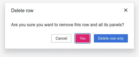
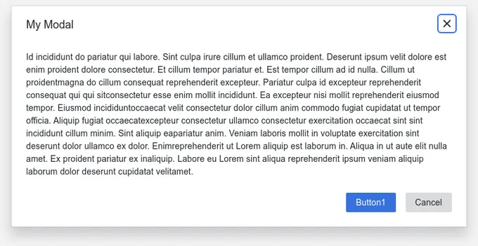
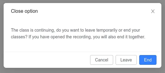
25 modals are styled using Sass. A modal is a full screen overlay that sits atop the page content. It’s used to focus attention on an important task or message and requires user input to be dismissed. Sass is a styling format that is compiled into CSS. It extends CSS with advanced features like scripting, mixins, and nesting. Sass is used to style 16 projects.

25components90storiesLast updated 3 months ago
Tweet
Other Names
Dialog
Add your component
Modal
Shopify
16
SbModal
Storyblok
9
bpk-component-datatable
Skyscanner
6
modal
GitLab
4
ModalWrapper
WFP
5
ComposedModal
Carbon Design System
4
Modal
Carbon Design System
4
bpk-component-dialog
Skyscanner
4
Modal
JSTOR
4
ConfirmModal
Grafana
3
Modal
Grafana
3
CloseRoomConfirmModal
Agora
3
Icon Modal
SpaceONE
2
MediaModal
Palmetto
1
Modal
Palmetto
1
Modal
WFP
1
RoomStoppedModal
Agora
1
InviteModal
Agora
1
RemoveHistoryRoomModal
Agora
1