Details components
Details is an expandable panel that displays a summary of content and expands to reveal more help text when clicked on. It’s often used to make a dense content easier to skim.
10components25storiesLast updated yesterday
Other Names
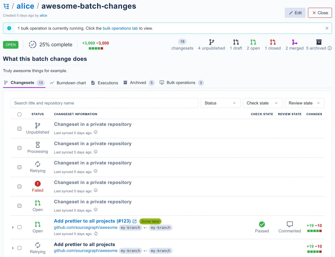
BatchChangeDetailsPage


Expansion Panel Details


Details

DetailPageMenuUI

DeviceOrientationControls

VisitorDetails


Email

Item Detail

DetailsForm

Speaker Details
