SAP fundamental-styles
Fundamental Library Styles is a light-weight presentation layer that can be used with developers' UI framework of choice (e.g.Angular, React, Vue, etc.). Developers can build consistent Fiori apps in any web-based technology, by combining Fundamental Styles, library of stylesheets and HTML tags.

- + 24
Horizon High Contrast Black
1
Horizon High Contrast Black
1
Horizon High Contrast Black
1
Horizon High Contrast Black
1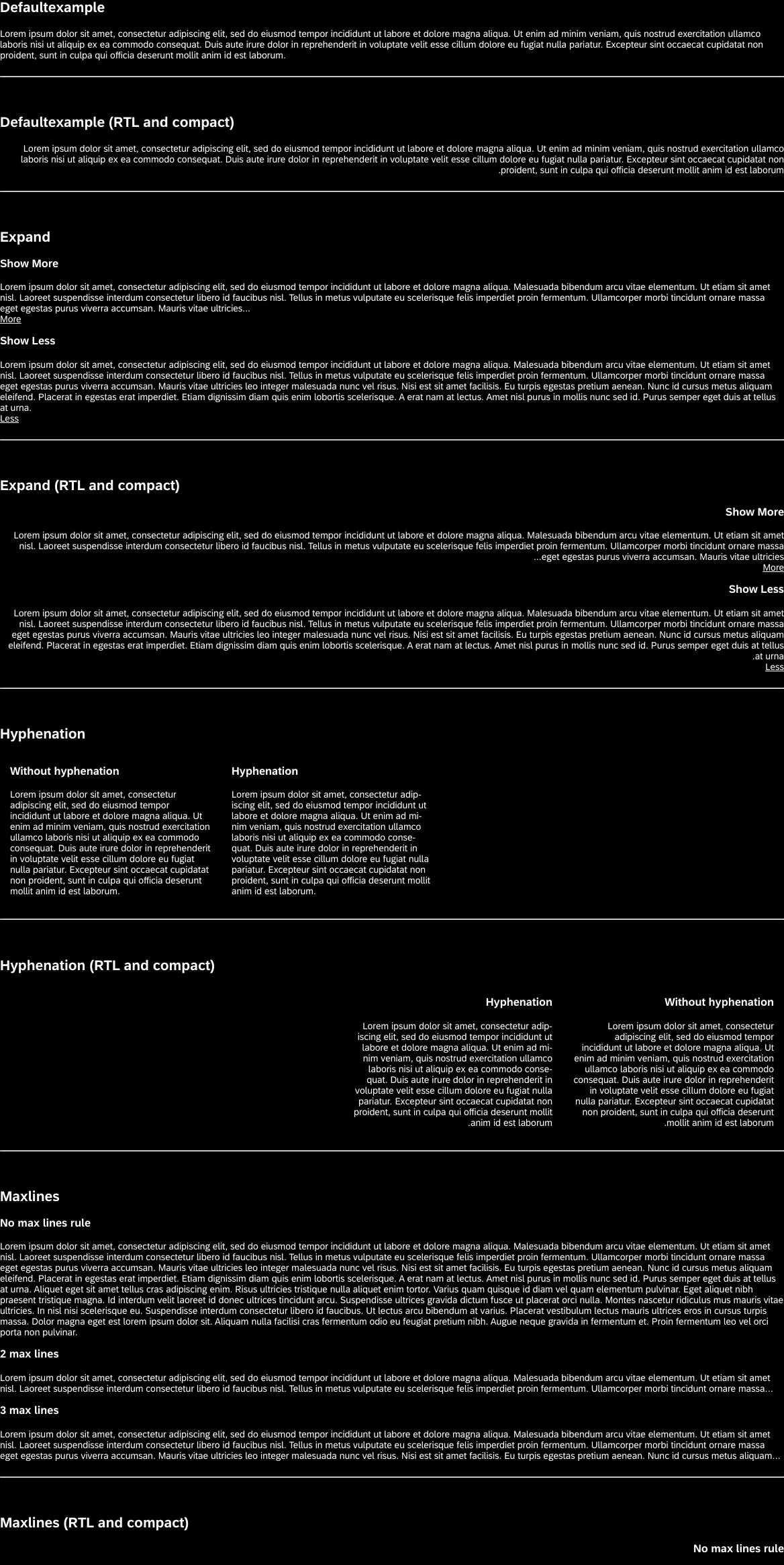
Horizon High Contrast Black
1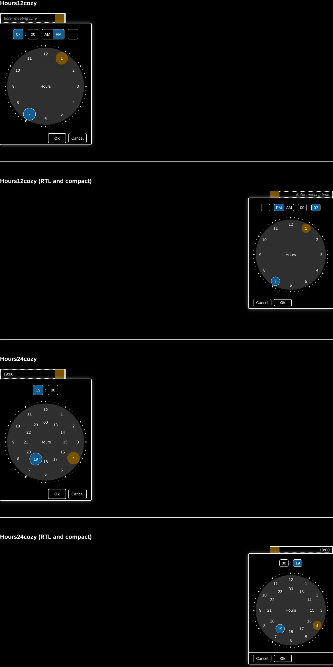
Horizon High Contrast Black
1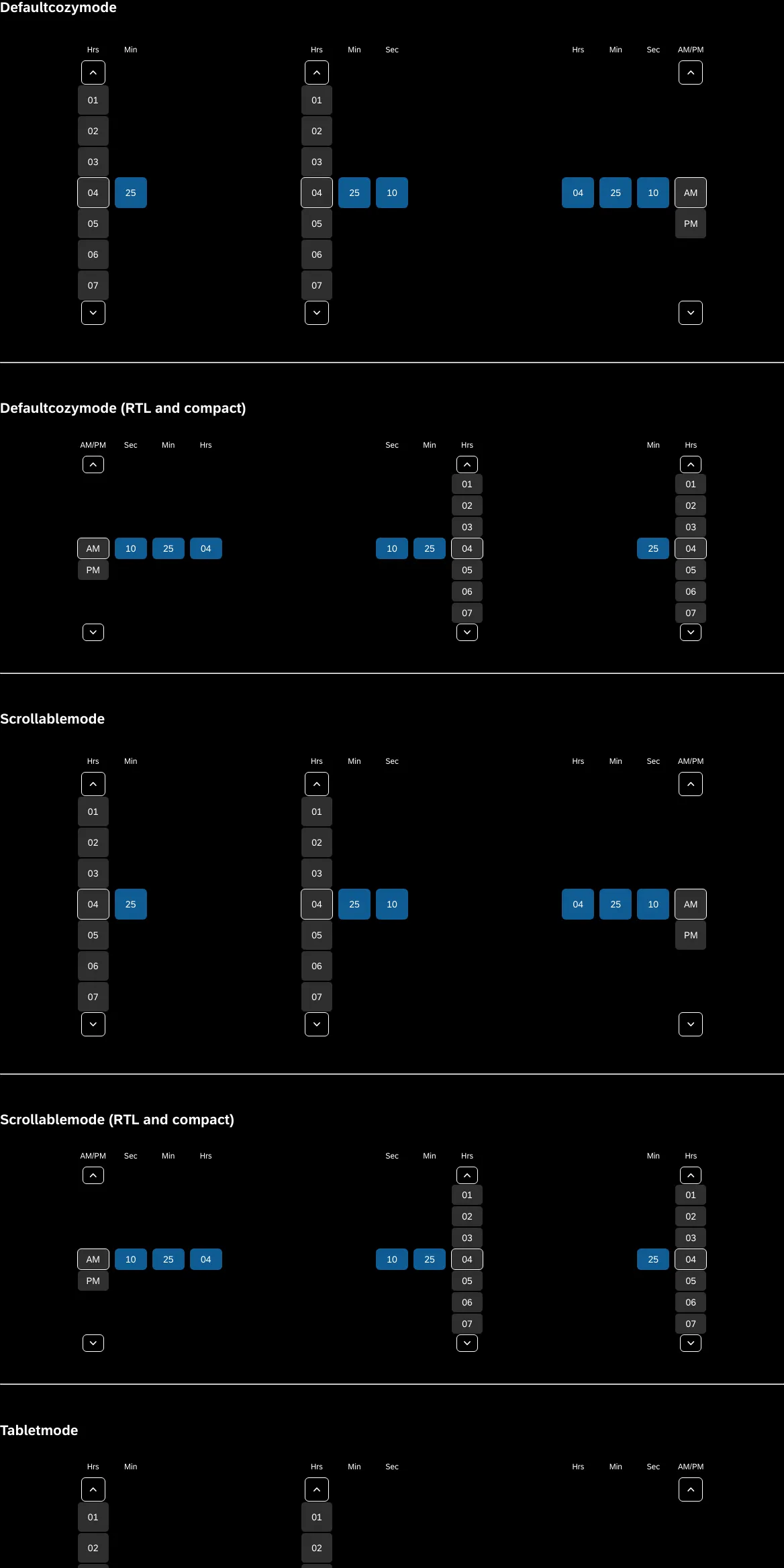
Horizon High Contrast Black
1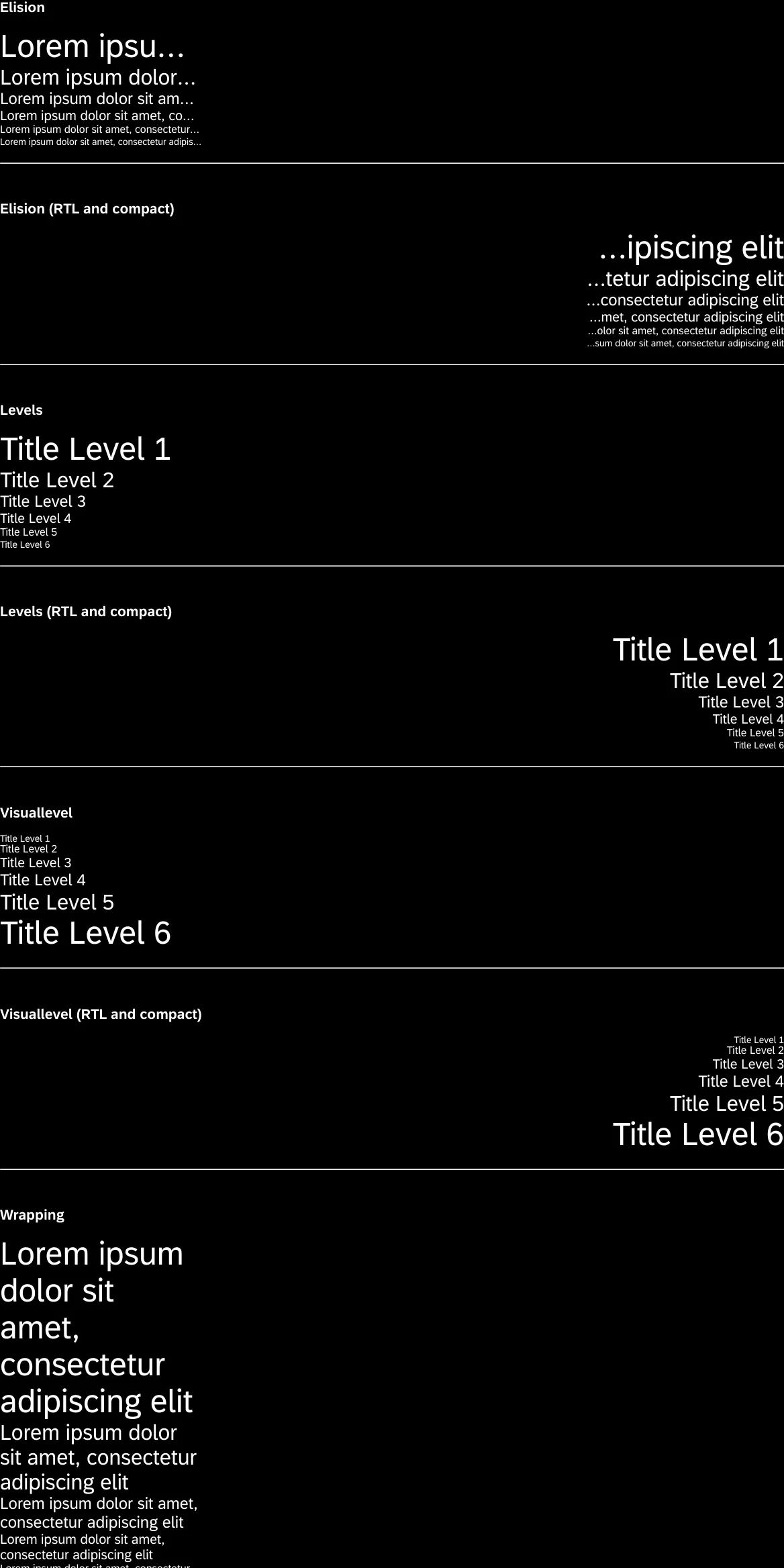
Horizon High Contrast Black
1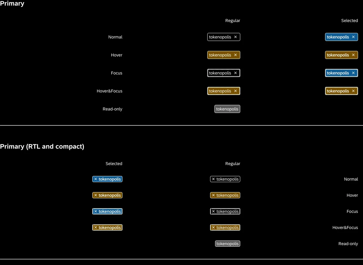
Horizon High Contrast Black
1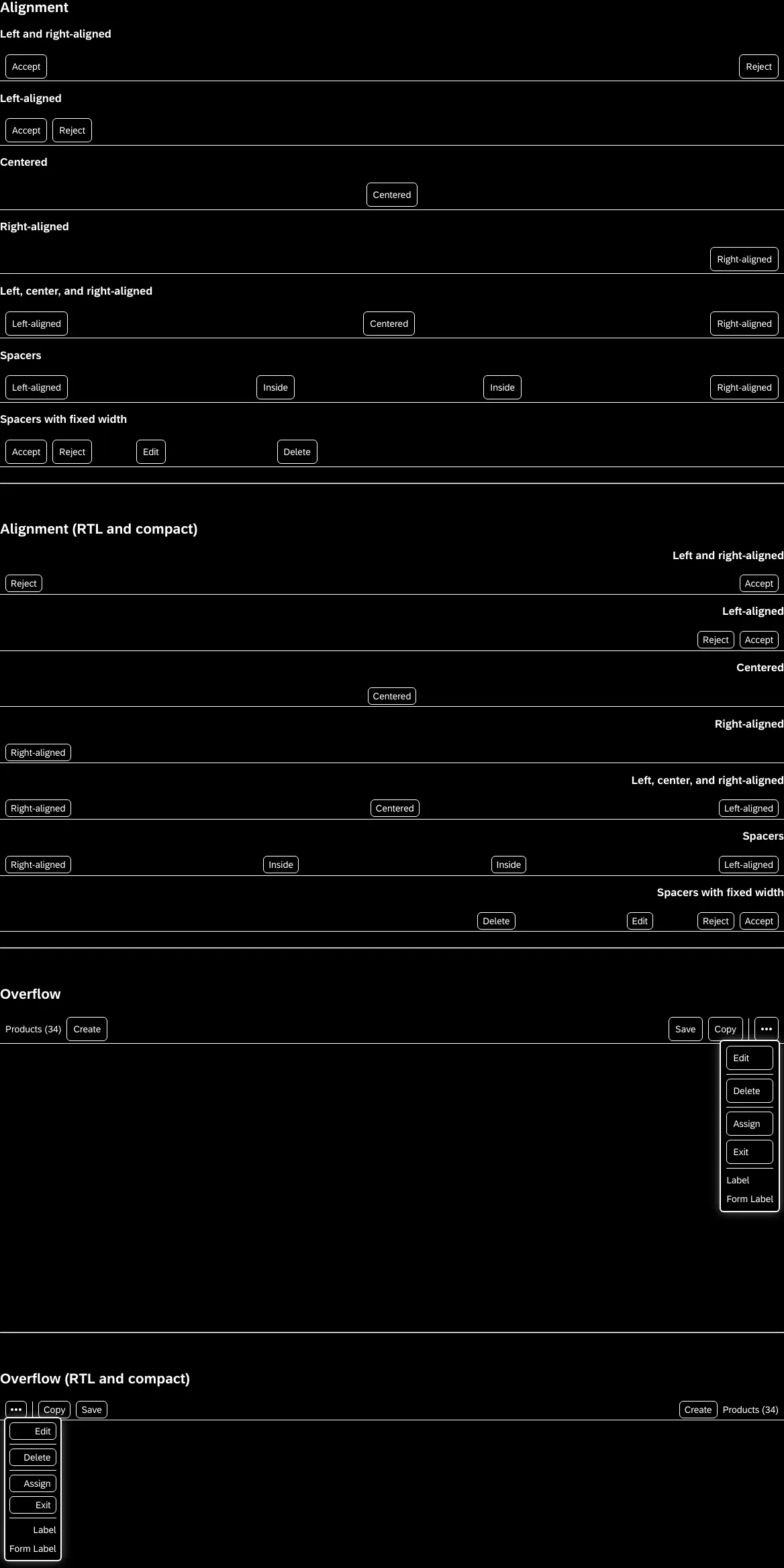
Horizon High Contrast Black
1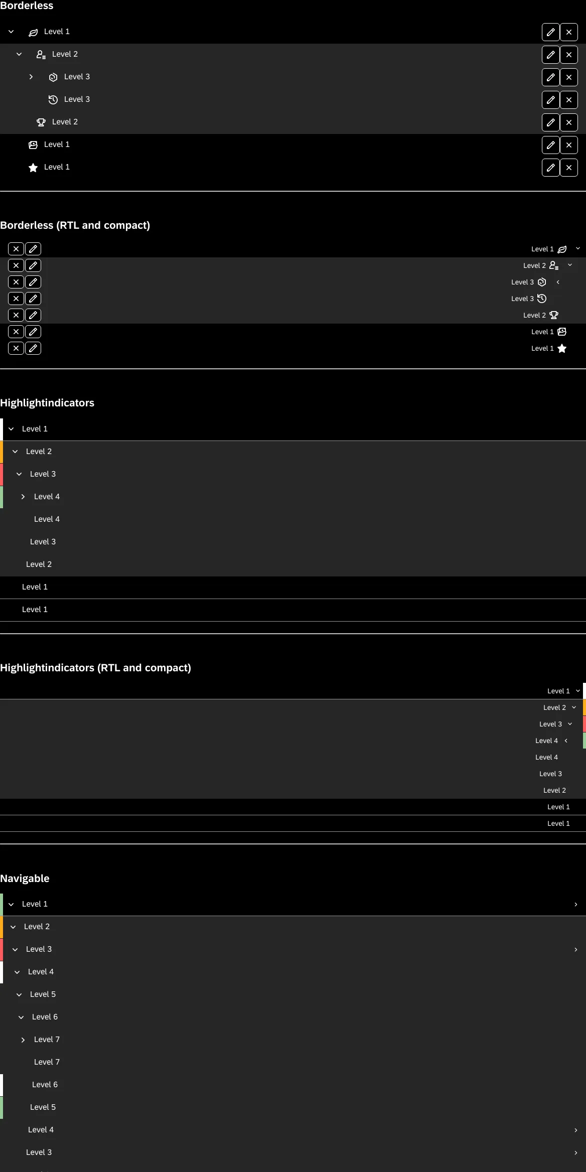
Horizon High Contrast Black
1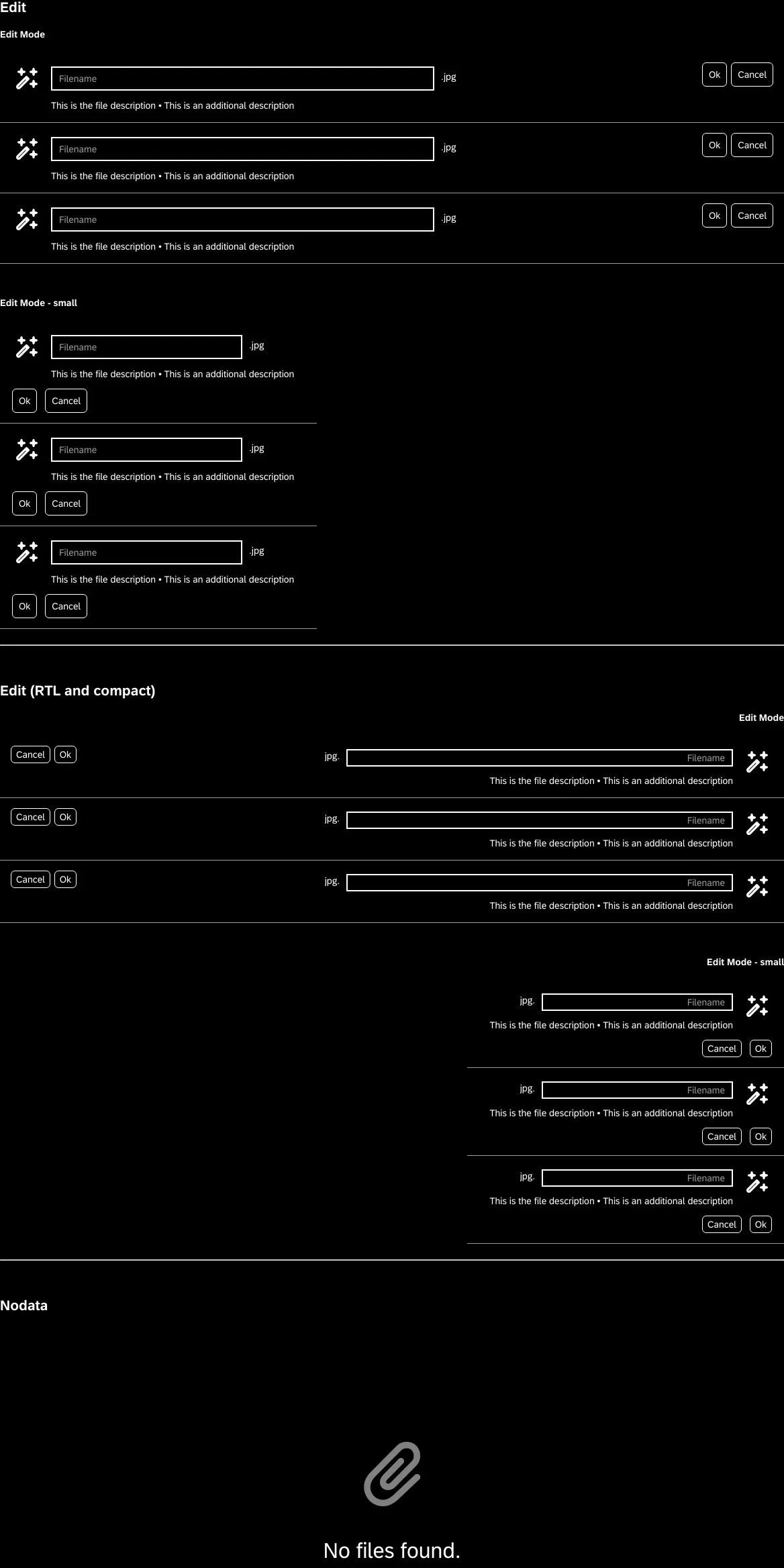
Horizon High Contrast Black
1
Horizon High Contrast Black
1
Horizon High Contrast Black
1
Horizon High Contrast Black
1
Horizon High Contrast Black
1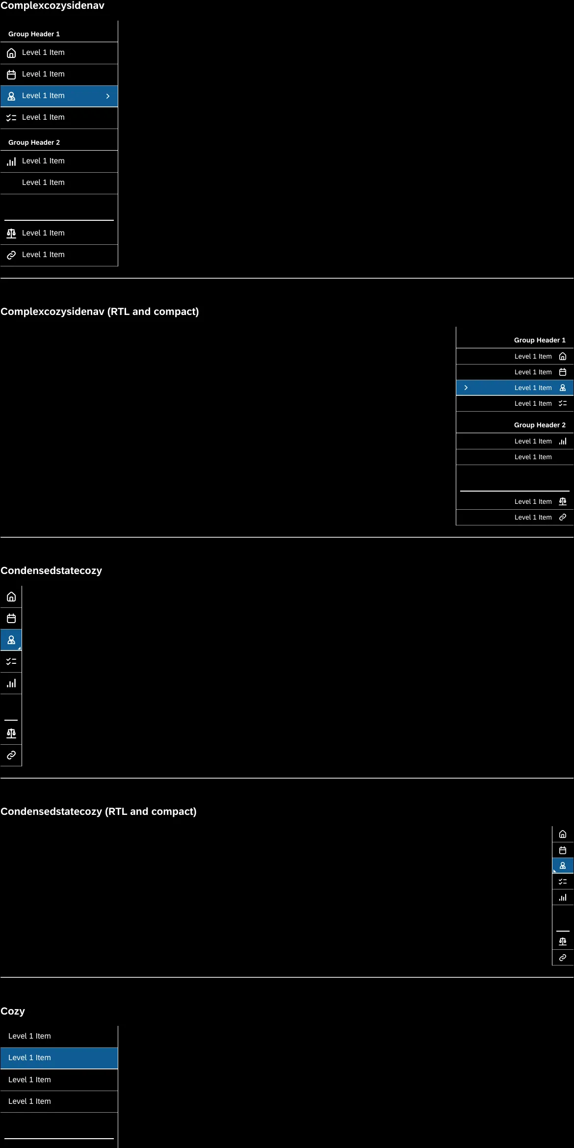
Horizon High Contrast Black
1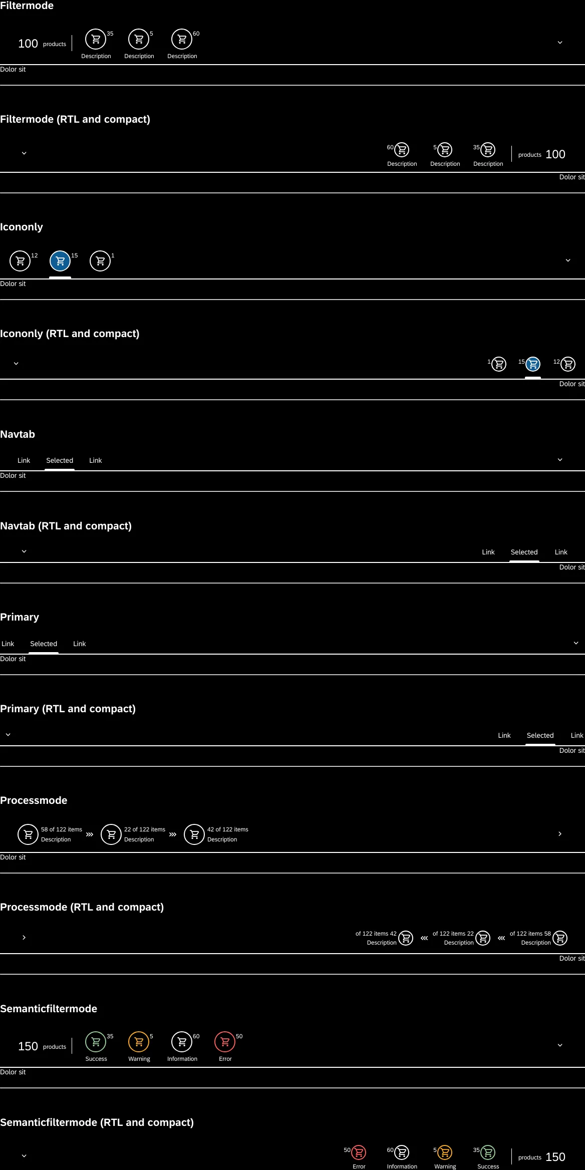
Horizon High Contrast Black
1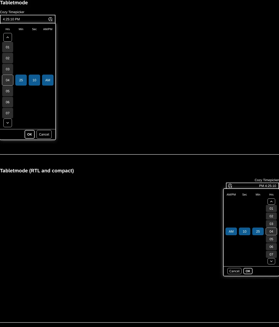
Horizon High Contrast Black
1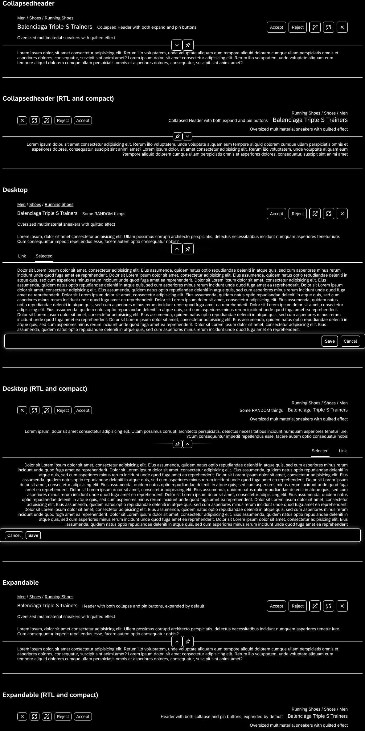
Horizon High Contrast Black
1Addons in this project
Actions
Get UI feedback when an action is performed on an interactive element
5.3M
Downloads
- + 8
Docs
Document component usage and properties in Markdown
4.8M
Downloads
- + 8
Viewport
Build responsive components by adjusting Storybook’s viewport size and orientation
4.8M
Downloads
- + 8
Controls
Interact with component inputs dynamically in the Storybook UI
4.8M
Downloads
- + 8
Toolbars
Create your own toolbar items that control story rendering
4.5M
Downloads
- + 8
Links
Link stories together to build demos and prototypes with your UI components
4M
Downloads
- + 8
Accessibility
Test component compliance with web accessibility standards
1.6M
Downloads
- + 8
Chromatic
Automate visual testing across browsers. Gather UI feedback. Versioned documentation.
1.4M
Downloads
- + 7
Similar projects
Add your projectReavizReaviz chart library
Reaviz chart library


ReavizReaflow diagrams
Reaflow diagrams

