MakerKit UI
The Makerkit UI is a React component library that is used to build the Makerkit web app. It is built on top of Headless UI and Tailwind CSS. It's meant to be clean and simple, and to be used in conjunction with the Makerkit API.


Alert
4
AuthProviderButton
6
Badge
3
Button
9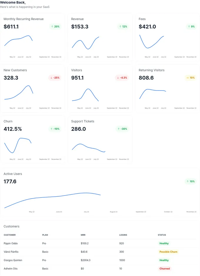
Dashboard
1
Dropdown
1
FallbackUserAvatar
2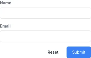
Forms
1
Heading
6
Hero
1
IconButton
2
ImageUploadInput
2
Label
1
ListBox
3
Modal
2
NewsletterSignup
1
PageLoadingIndicator
4
PricingTable
1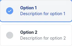
RadioGroup
1
Subheading
1Addons in this project
Links
Link stories together to build demos and prototypes with your UI components
4M
Downloads
- + 8
@storybook/addon-postcss
Storybook addon used to run the PostCSS preprocessor against your stories.
222k
Downloads
- + 20
storybook-dark-mode
Toggle between light and dark mode in Storybook
231k
Downloads
Next.js router
Use Next.js Router in your Storybook stories.
67k
Downloads