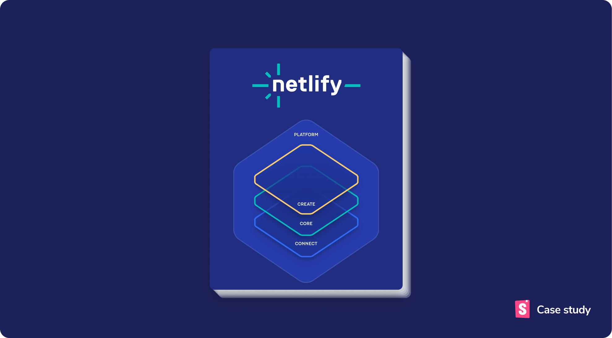
How Netlify rebranded their app in just 6 weeks
A masterclass in rebranding with Storybook and Chromatic

Netlify has been a leading web development platform for more than 9 years. Today, their services are used by over a million developers for deploying apps and sites.
Earlier this year, Netlify rebranded all their properties—including the marketing pages, docs site, and in-app UI. With all the moving parts, stakeholders, and timezones to consider, this type of work often takes six months or more.
Here’s how Netlify used Storybook and Chromatic to achieve it in just six weeks.
Early access: Combine Chromatic and Storybook in one interface with Storybook's new Chromatic Visual Test addon. Get early access now ≫
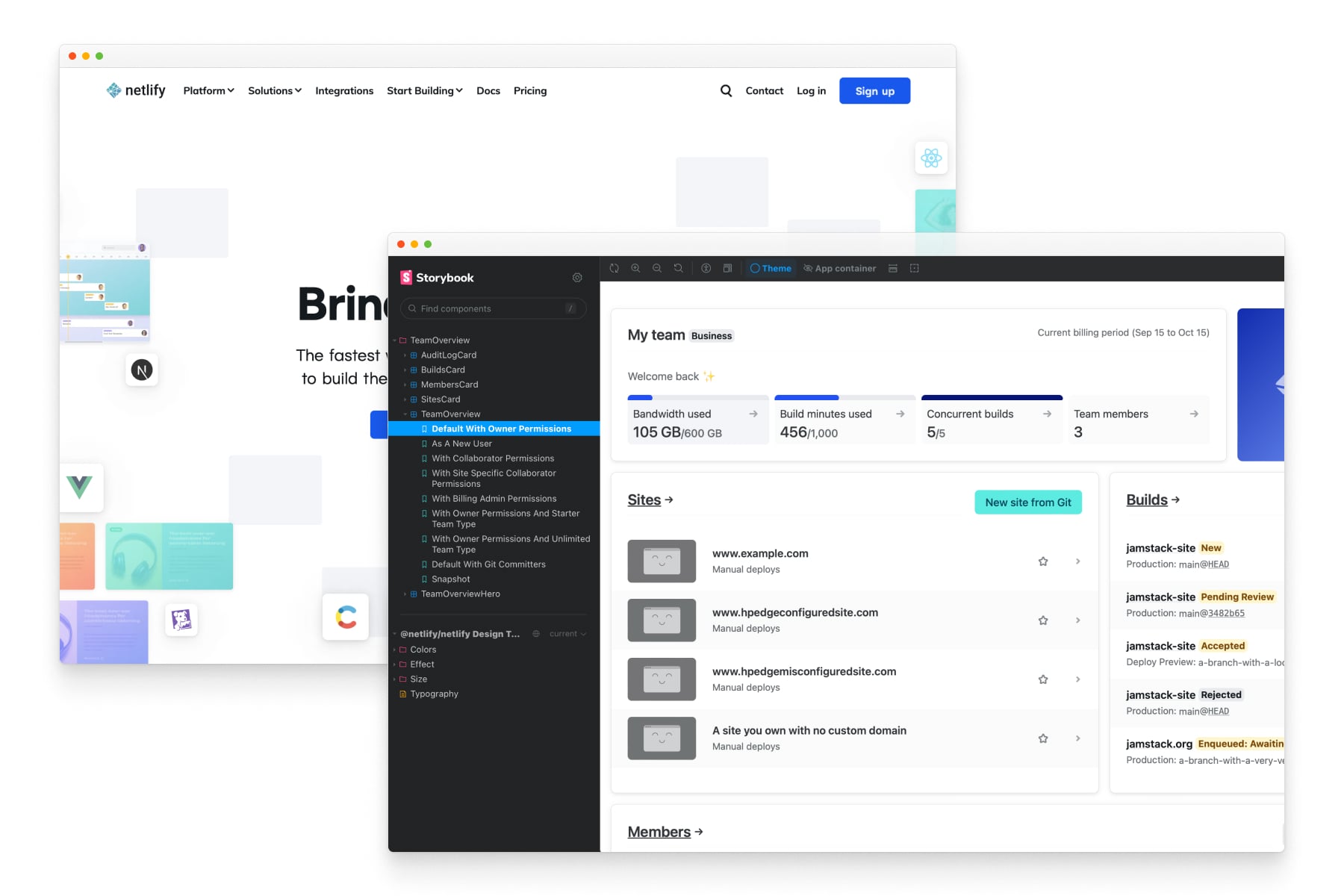
Netlify’s UI stack
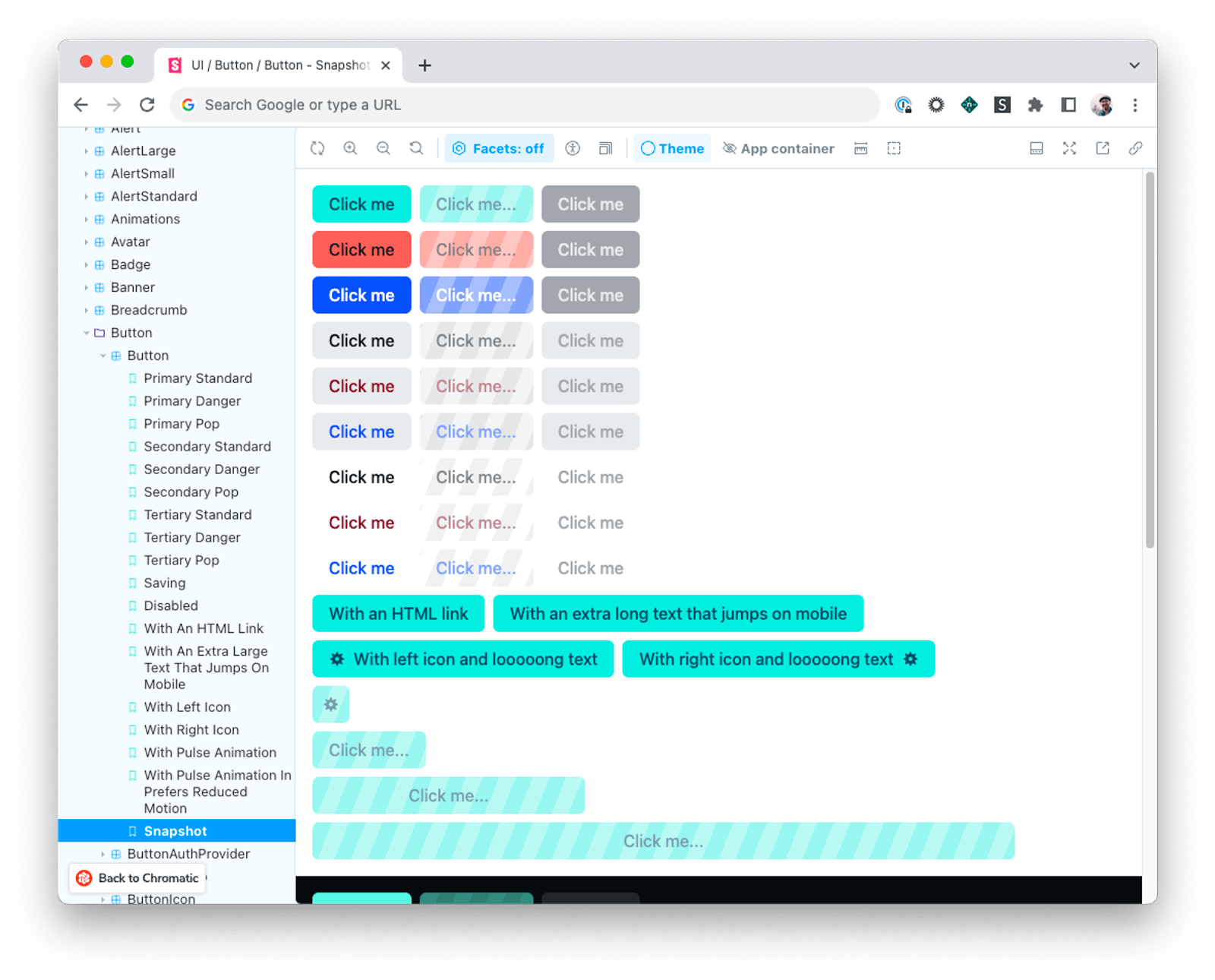
Netlify's developers create UI components with React and Tailwind CSS. They organize all their components and variations in one place with Storybook.
Storybook is a single source of truth for UI that's referenced by all teammates – from devs and designers to product owners. Here's more on how the Netlify team use Storybook.
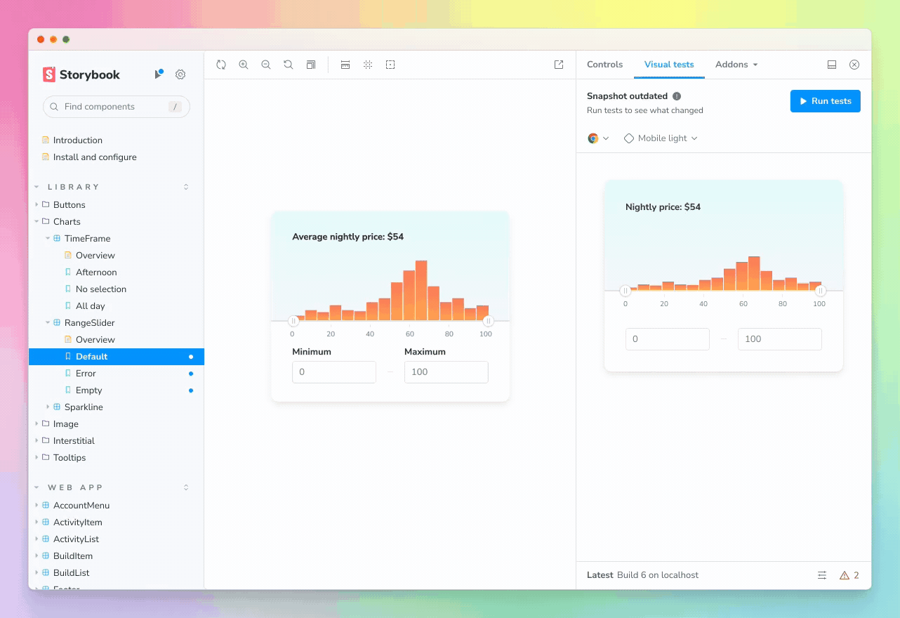
Netlify automate this workflow with Chromatic (Storybook’s sister tool, created by Storybook's core maintainers). It lets them visually tests stories automatically and publish their Storybook for others to reference. QA can often feel like the world’s longest game of “spot the difference.” Chromatic cuts out those headaches for everyone.
Storybook and Chromatic played a pivotal role in Netlify’s app rebranding, providing coverage of around 2,500 different stories. Let’s look at the challenges Netlify faced.
A new color scheme
The first phase of Netlify’s rebranding centered on the implementation of a new color scheme. One of the main features was an update to the Netify brand teal color, used across the app's fonts and components. They also introduced a new palette of greens for success states.
As a start, the team updated the global color tokens, then used Chromatic to track the resulting changes as they rippled through the app and verify that the new colors appeared correctly. During this process, Netlify learned they had unknowingly been misusing their brand colors for some time.
The primary brand teal was only meant for brand elements. However, Chromatic identified that it was accidentally being used app as both an action and a success color. This resulted in muddying not only their brand but the app's UX.
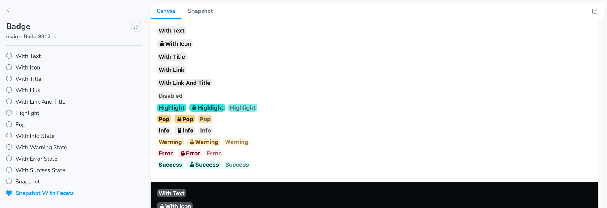
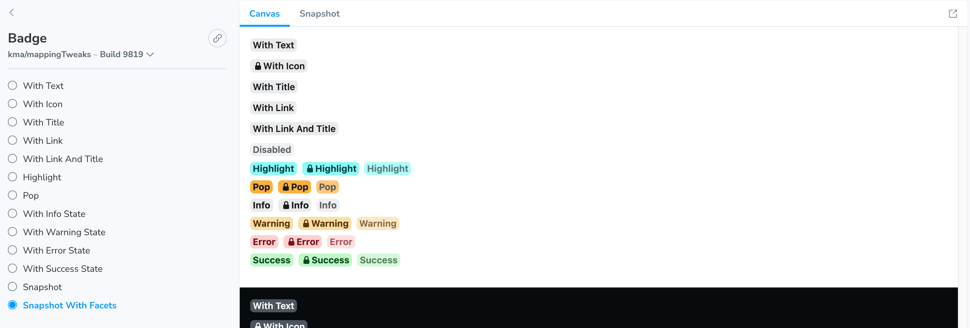
Netlify's Badge component – before and after the color updates
Surfacing visual diffs on previously unknown components helped Netlify improve UX and correctly implement their brand guidelines.
To make visual comparisons more easily as they worked, Netlify also built a custom Storybook addon. It allowed them to toggle between the old and new range of brand colors.
These kinds of local, automated visual tests will soon be available directly in Storybook. That’s coming as part of the new Chromatic Visual Tests addon. It’s available in early access, so sign up now!
"I was confident that the nooks and crannies of the app were covered! That provided a great sense of calm."
Kristy Marcinova, Staff Product Designer at Netlify
A new logo

No rebrand is complete without a new logo. The process of doing that might sound like a fairly straightforward find-and-replace. Yet Netlify quickly learned that the old logo featured in a ton of surprising places – including illustrations and mascots. Tracking down all of these manually would be a huge amount of manual detective work.
Instead, Netlify used Storybook and Chromatic. After updating the logo SVG file in Storybook and committing the changes, Chromatic automatically surfaced every place the old logo appeared for the team to review.
Updating designs at scale
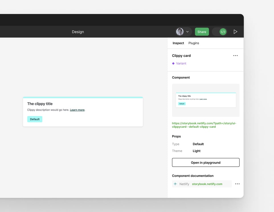
Netlify needed to update hundreds of component variants to the new designs. Using Storybook made this process a breeze. Netlify linked all their designs in Figma to the equivalent implementation in Storybook which made it straightforward to spot any components that needed updating.
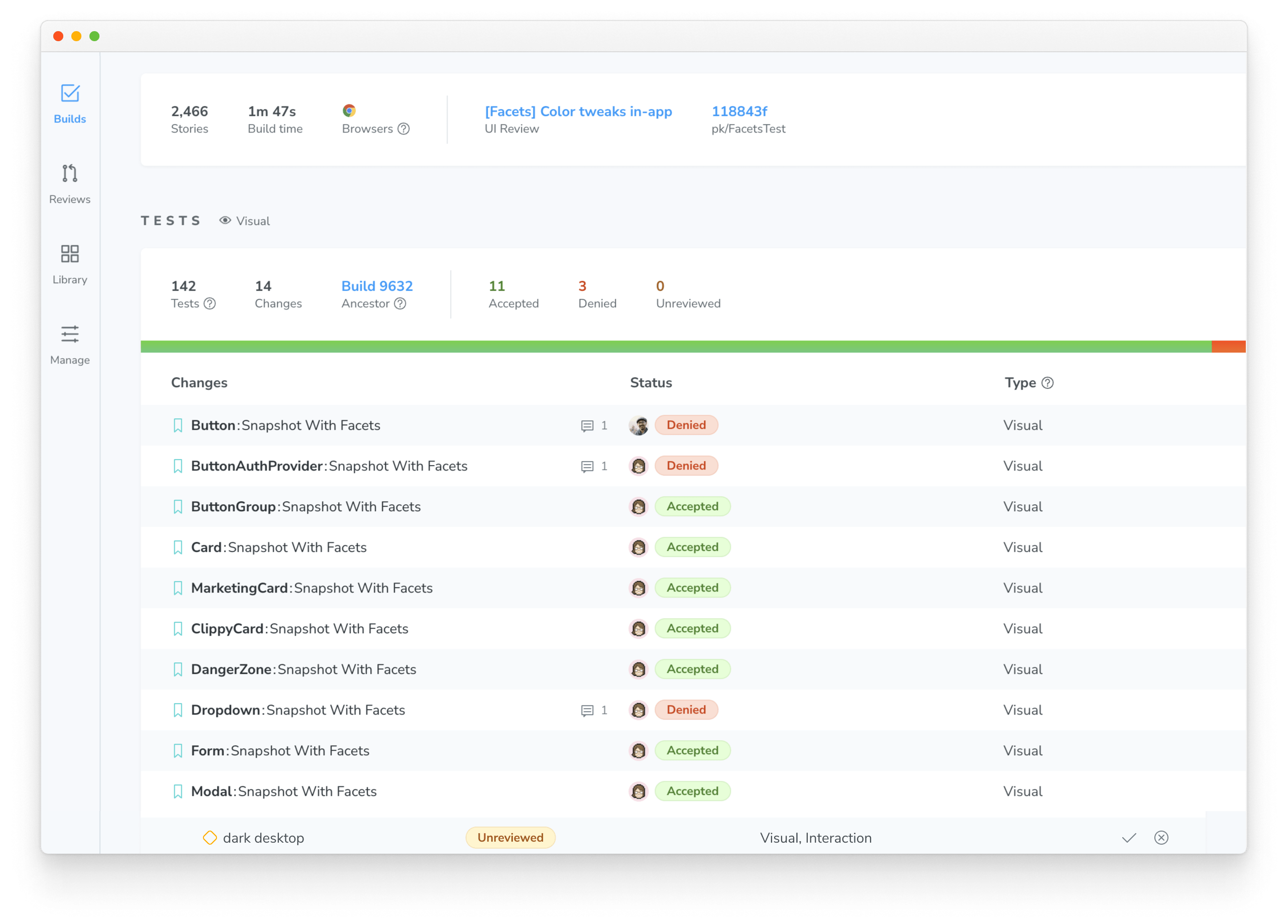
Once that was done, Netlify used Chromatic to validate those changes. After each commit, new snapshots were taken of changed component and then compared to previous baselines to detect changes.
Visual testing with Chromatic – coming soon to Storybook in the Chromatic Visual Test addon – let designers on the team commit code without breaking things in prod. That's because Chromatic captured any unintended errors before merging. This meant that tweaks to finishing details like changing teal to green could be made in code independently by designers, without taking developer time.
"It was a big relief to know we weren’t forgetting anything we’d only uncover by digging through the code."
Prabhav Khandelwal, Product Designer at Netlify
Sign off with non-technical stakeholders
Developing components in Storybook is a natural way of gathering UI into one place for stakeholder review. Netlify used Chromatic’s collaboration tools to allow teammates to give explicit sign-off on each story before shipping. Stakeholders can leave implementation feedback and discuss UI changes in one place.
Redesign complete
In a project with lots of teammates that have different priorities and technical knowhow, it can be tough to bring everyone together in one place.
With Storybook and Chromatic, Netlify completed a complex project in an uncomplicated way. They were able to thoroughly update each UI state, prevent bugs, and ship a rebrand in record time.
Thank you to Kaelig Deloumeau-Prigent, Kristy Marcinova, Prabhav Khandelwal and the whole Netlify team for collaborating with us on this article!
Interested in following Netlify's example by automating visually testing in Storybook? Sign up now for early access to Chromatic Visual Tests addon!
This year, @Netlify used Storybook + @chromaui to completely rebrand their app UI in just 6 weeks 🤯
— Storybook (@storybookjs) October 26, 2023
Here's how they did it 👉
🎨 Updating colorschemes
🎞️ Automated tests across 2,000+ stories
🤝 @figma integration
🙌 Non-technical UI reviewhttps://t.co/MiYFegvv7w