Interactive story generation
Make your first story in seconds without leaving the browser!

Do you remember the first time you encountered Storybook’s Component Story Format (CSF)? CSF is a concise API to write component stories—snippets of JavaScript that capture key UI states. Creating a minimal story can be as easy as writing an empty object ({}), but CSF is feature rich and scales up to allow you to create, document, and test even the most complex UI components, states, and behaviors.
But let’s be real. The first time you dive into CSF, it can be overwhelming. You might feel lost trying to grasp all its nuances.
This is why we’re thrilled to introduce the interactive story generation feature—a brand-new way to generate CSF stories. Now, in Storybook 8.1, you can:
- 🎛️ Create new stories using controls
- 💾 Save modifications to existing stories
- ✨ Add new components from Storybook’s UI
This is a giant leap forward in usability. It means that you can experiment with your components in the UI and create stories out of interesting states without leaving your browser. It also lowers the barrier for non-developer teammates to contribute. Read on for details and how to integrate it in your workflow.
What is Storybook?
Storybook is the industry standard for creating, testing, and documenting UI components. You can import a component in Storybook, no matter how complex, and develop it in a standalone sandbox environment, using examples. These examples—called “stories”—are then available to revisit at any time and can be used for automated tests and component documentation.
Here’s an example of a basic story written in Component Story Format (CSF):
// MyComponent.stories.ts
import { Meta, StoryObj } from '@storybook/react';
import { MyComponent } from './MyComponent';

const meta = {
  component: MyComponent,
} satisfies Meta<typeof MyComponent>;

type Story = StoryObj<typeof meta>;

export const Primary: Story = {
  // The specific props for "Primary" can be defined here.
}
CSF is simple to get started, but also flexible enough to accommodate even the most complex components. Want to mock your Redux Store or http requests? Or document your component with different themes? No problem. Storybook can define your components in any desired state and record it as a story.
Save new stories from the UI
The first time I wrote a story and watched my component come to life in Storybook, it was a liberating feeling! Having a playground without having to start my main application and get it into a specific state makes development so much easier.
As soon as the first component’s story is ready, you usually want to create more stories. Even a simple Button, for example, can take on many forms: primary or secondary, large or small, with or without an icon, and so on. Thanks to TypeScript and autocomplete, this can be done fairly quickly. But what if you didn’t have to write the code for a story at all?
Since Storybook 8.1, we can now shorten this process: If a story for a component exists, we can now create new stories based on that existing story or modify existing stories directly from Storybook's UI. It’s as simple as changing a story’s controls and pressing the Save or New button.
Creating a new story for the Avatar component
The new or modified story will appear as a code change in that component’s CSF file and will be automatically formatted to match the code style and formatting of your project. To complete the process, treat it as any other code change and commit it to your repository. Jumping back and forth between browser and editor is no longer necessary.
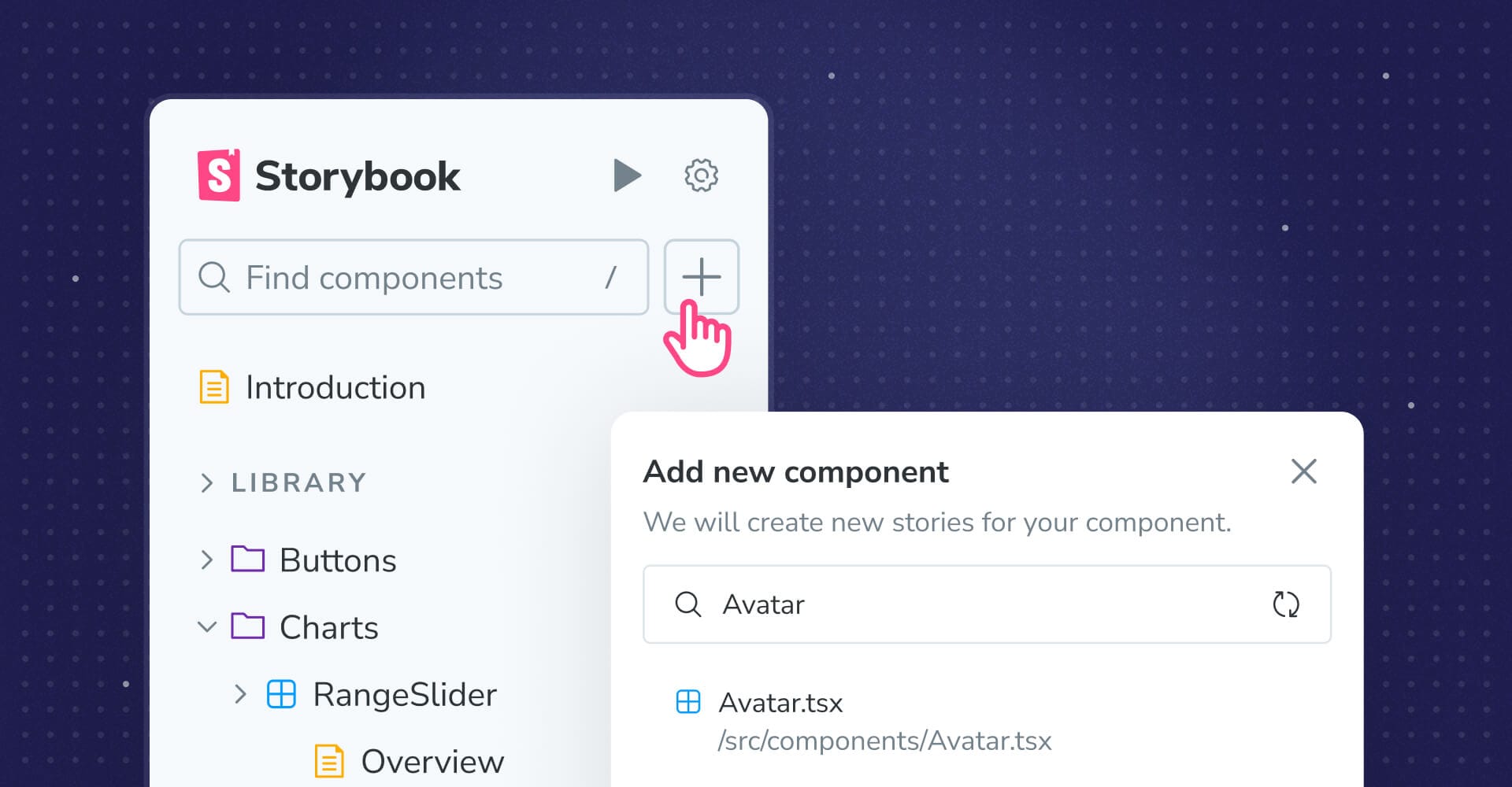
Add new components from the UI
If your project uses React, we have placed a plus icon in the sidebar to find and add new components from the Storybook UI. Storybook analyzes the component and creates a new story file with placeholder values for required properties. No more searching through directories or creating new files in the editor. It’s all managed directly within Storybook now.
Just like when creating stories, creating a new component story file will produce a code change, which you then commit to your repository.
Adding a new Avatar component from the Storybook UI
By the way, the component search also supports glob patterns!
Try it today
Interactive story generation is available in Storybook 8.1. Try it in a new project:
npx storybook@latest init
Or upgrade an existing project:
npx storybook@latest upgrade
To learn more about interactive story generation (and the controls used to generate them), please see the Storybook documentation.
What’s next
Interactive story generation is stable and available in Storybook 8.1 today. We are considering the following enhancements:
- Creating and editing stories is available for all renderers, but the ability to add new components from the UI is currently a React-only feature. We hope to roll this out to all renderers in the future.
- Adding new components is error-prone. For example, if your component requires a specific context provider to render correctly, this is not something Storybook can easily infer. However, we can do a better job of surfacing that error and helping you resolve it quickly. And we plan to!
- Generating a single story and allowing you to edit it from the UI is a huge step forward. But what about generating a whole suite of stories like Storybook GPT? This is also a direction we are exploring.
For an overview of projects we’re considering and actively working on, please check out Storybook’s roadmap.
Interactive story generation: Edit and create stories from Storybook’s UI!
— Storybook (@storybookjs) June 6, 2024
🎛️ Create new stories using controls
💾 Save modifications to existing stories
✨ Add new components from the sidebar
Let’s look at each one… pic.twitter.com/FCKcyrvZ7l